# Forms
# Text input
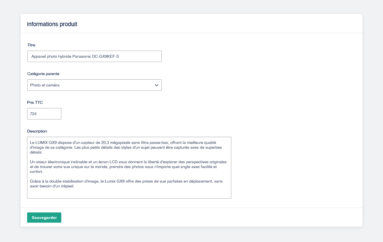
- Inputs' width should match the type of data entered by the end user if possible.
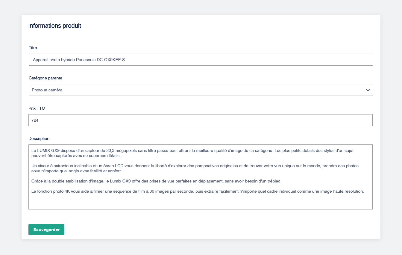
- Avoid full width text inputs, textarea included. It's too hard to read and messy.
# Examples

Don't
Full-width forms are harder to fill. Dropdown's arrow isn't visible at first glance.
It's hard to read the description in the textarea.

Do
It's easier to use forms that seem to be suited for the kind of data the user has to fill in. Dropdown is more obvious.
The description in the text area is now readable.
# Segmented control
Segmented control is a great way to let the user choose between 2 to 5 options.

# Toggle Switch
The switch can be used in order to replace 2 radio buttons or 2 options in a segmented control.
⚠ Toggle switch preferably must be used if the action takes effect immediately, without having to click on a save button.
# Dropdown
For a larger list (> 5 options), use a dropdown.
Do not forget the default placeholder.
